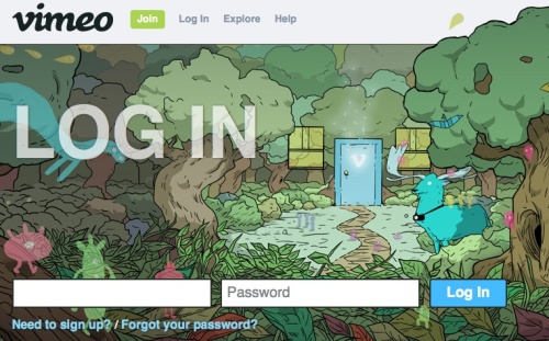
Just quickly, some log-in pages of popular services have gone to the too fancy side of things. Which is not really usable. Let’s see, as an example, vimeo:
So, when I browse to the log-in page, the focus goes to the first text field to enter the… username? Maybe the e-mail address? Maybe both are ok, as it is increasingly the case (btw, how do they handle md5 in this case?)?
OK, so you’ll have to tab to the password field so that the focus leaves the first field to discover that only e-mail does the job, and then Shift+tab back to fill it in. Sorry, but there are so many services we use each and every day nowadays, that it’s not very usable to do that all the time.
Overall, the recent vimeo redesign was lovely and only details like this were not taken care of. And, in fairness, many popular services now have the same log-in model (auto-focus on the field) which is why I decided to write about it. It’s not that I have a problem with vimeo in general (it should go without saying, since I am using their service, but you never know).
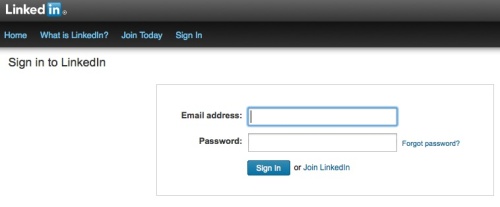
So, I prefer services that have remained a bit more old-fashioned and always show you what they need from the user, so far Linkedin and WordPress are like that. See below.
Linkedin ask for your e-mail and, despite the auto-focus, you know, because the label is before the text field.
WordPress is good with e-mail or username (really, if you know how the md5 works in this case leave a comment), again the label is before the text field.
Next time you design a log-in page, consider! 🙂


